BETH YEE REAL ESTATE AGENT
Beth Yee guides individuals, families, and investors to make elevated real estate decisions that provide enduring value, long-term stability, and a legacy to be proud of.
Beth Yee helps individuals, families, and investors in Oahu make smart, confident real estate decisions within the ever-changing, complex market. With many competing realtors and brokerages to choose from, clients can feel overwhelmed and unsure about who to trust. Beth promises expert guidance, honest advice, and a clear, streamlined process that supports clients’ long-term stability and peace of mind. Unlike bigger teams or DIY platforms, Beth offers exceptionally reliable communication and personalized, client-first service. She ensures every client feels supported, informed, and genuinely cared for from start to finish.
Services Provided
Brand Strategy
Visual Identity
Graphic Design
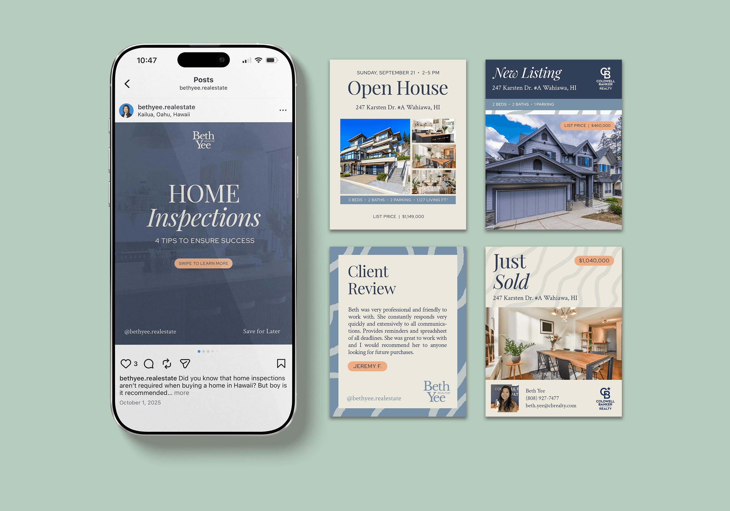
In a saturated real estate market, credibility is everything. Beth’s previous branding didn’t fully reflect her expertise or the quality of her services. While her client experience was high-touch and highly personalized, her visual presence felt less polished. She came to Izzy’s Design Desk to build a brand that would elevate her professionalism, strengthen trust, and position her as a go-to agent for clients navigating O‘ahu’s complex real estate market.

Brand Strategy
Beth Yee's brand was reimagined to reflect the level of care, expertise, and professionalism that defines her client experience. Known for her clear communication and honest, client-first guidance, Beth serves as a trusted partner through one of life’s biggest decisions. She offers a personal, hands-on experience, ensuring every client feels supported, informed, and genuinely cared for from start to finish. We defined the brand’s visual attributes as luxurious, sophisticated, organic, and approachable. The goal was to create a brand that reflects both the high-value properties she represents and the relational way she works with clients. Rather than leaning overly corporate or overly casual, the direction strikes a balance. It's elevated yet inviting, polished yet warm. The result is a brand that builds immediate trust and credibility, while still feeling personal and easy to connect with.

Logo
The logo is rooted in a classic structure with a subtle (yet intentional) emphasis on Beth’s initials. By scaling the “B” and “Y” to match the height of the surrounding letterforms, the mark introduces a sense of distinction. It elevates her name while maintaining balance and restraint. The result is a wordmark that feels both sophisticated and personal.


Visual Language
The visual identity brings Beth’s brand to life through a balance of refinement and ease. The overall system is designed to feel polished without being overly formal. It's designed to reflect both the high-value nature of her work and the calm, supportive experience she provides to her clients. Subtle coastal accents tie the brand to its O‘ahu roots in a way that feels natural rather than literal, creating a cohesive look that is both elevated and inviting.


TYPOGRAPHY
The typography system features a modern serif that brings a sense of professionalism and quiet luxury to the brand. Its clean structure ensures clarity and readability across applications, while its subtle character adds warmth and approachability. It's paired with a classic serif for body text and a simple sans serif for highlights. Beth's typography feels elevated enough for high-end listings, yet accessible enough for everyday communication.


PATTERN
The brand pattern introduces a layer of visual interest while reinforcing the organic, coastal feel of the identity. Inspired by natural movement and subtle textures, it adds depth without overwhelming the overall design system. Used sparingly across touchpoints, the pattern helps create a cohesive and recognizable brand experience while maintaining the clean, sophisticated aesthetic at the core of Beth’s brand.

Project Success
Since launching the new brand, Beth’s business shows up with a stronger sense of clarity and credibility. The elevated visual identity better reflects her expertise and the quality of her service, helping her stand out in a highly competitive market. With cohesive, ready-to-use materials, she’s able to present herself more confidently, creating a seamless, professional experience that builds trust from the very first interaction.


